
An Apple Central & Apple Scout App Ui Ux Design is needed to provide an enjoyable and interesting listening experience. The design should put discoverability, usability, and customization first.
Overall Design Language:
Clean & Minimalist: Utilizes ample white space, clean lines, and a focus on content.
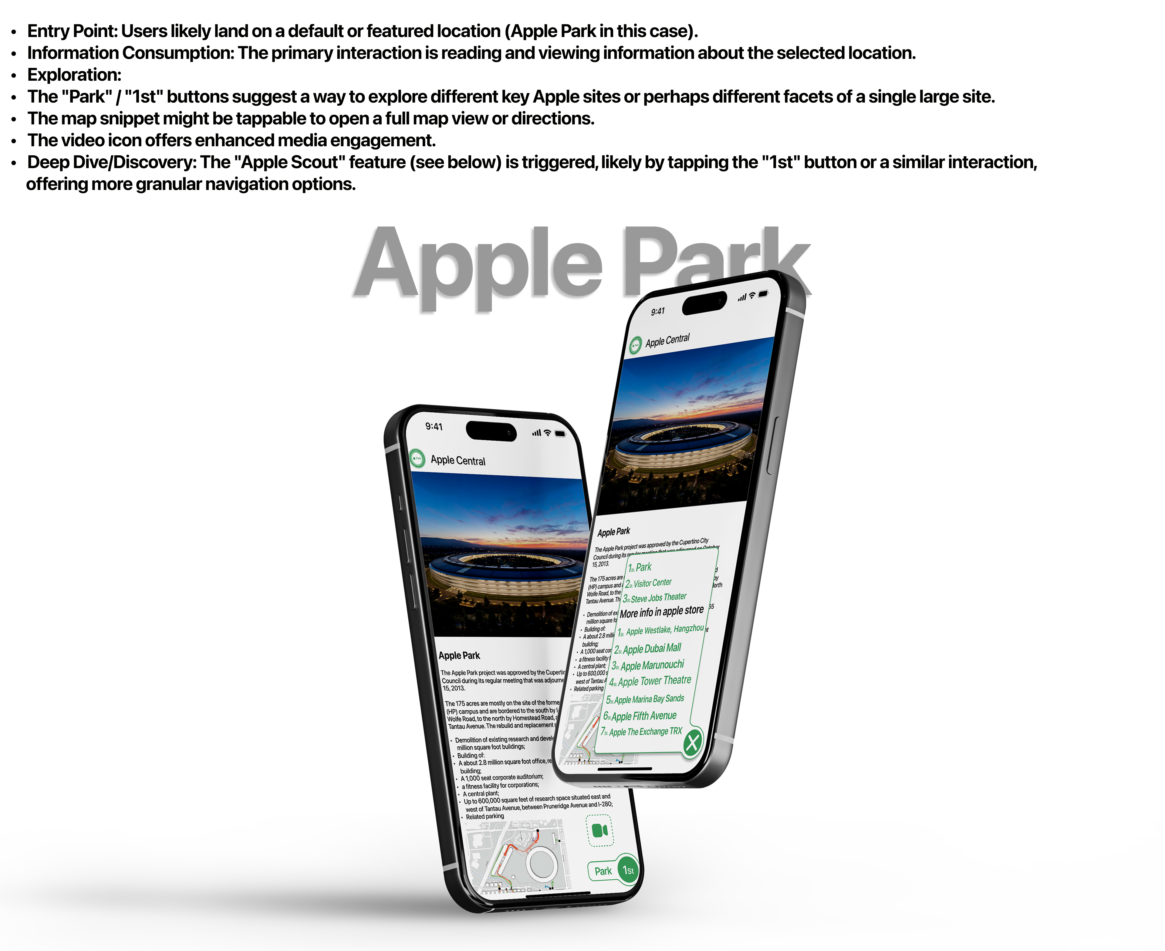
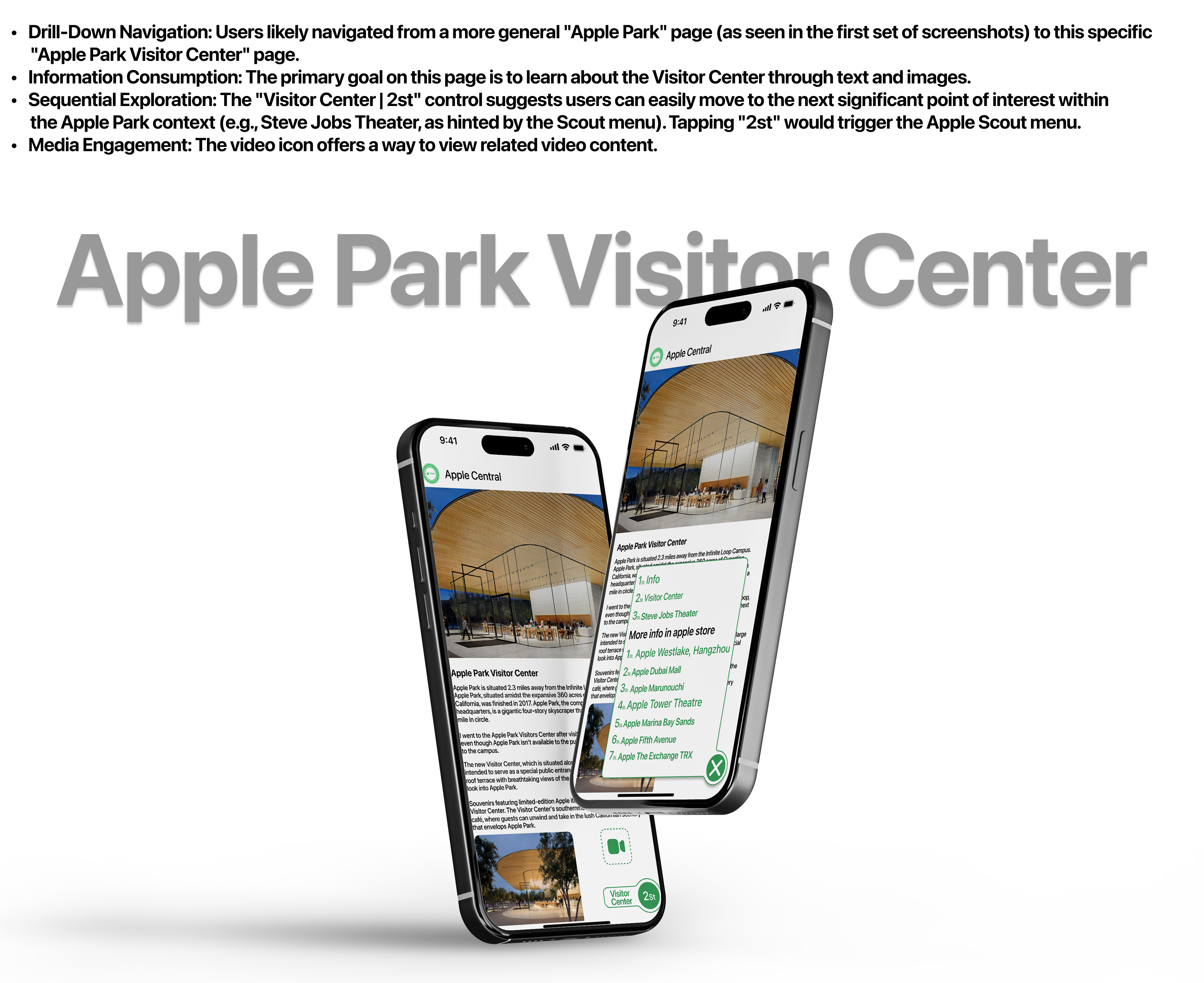
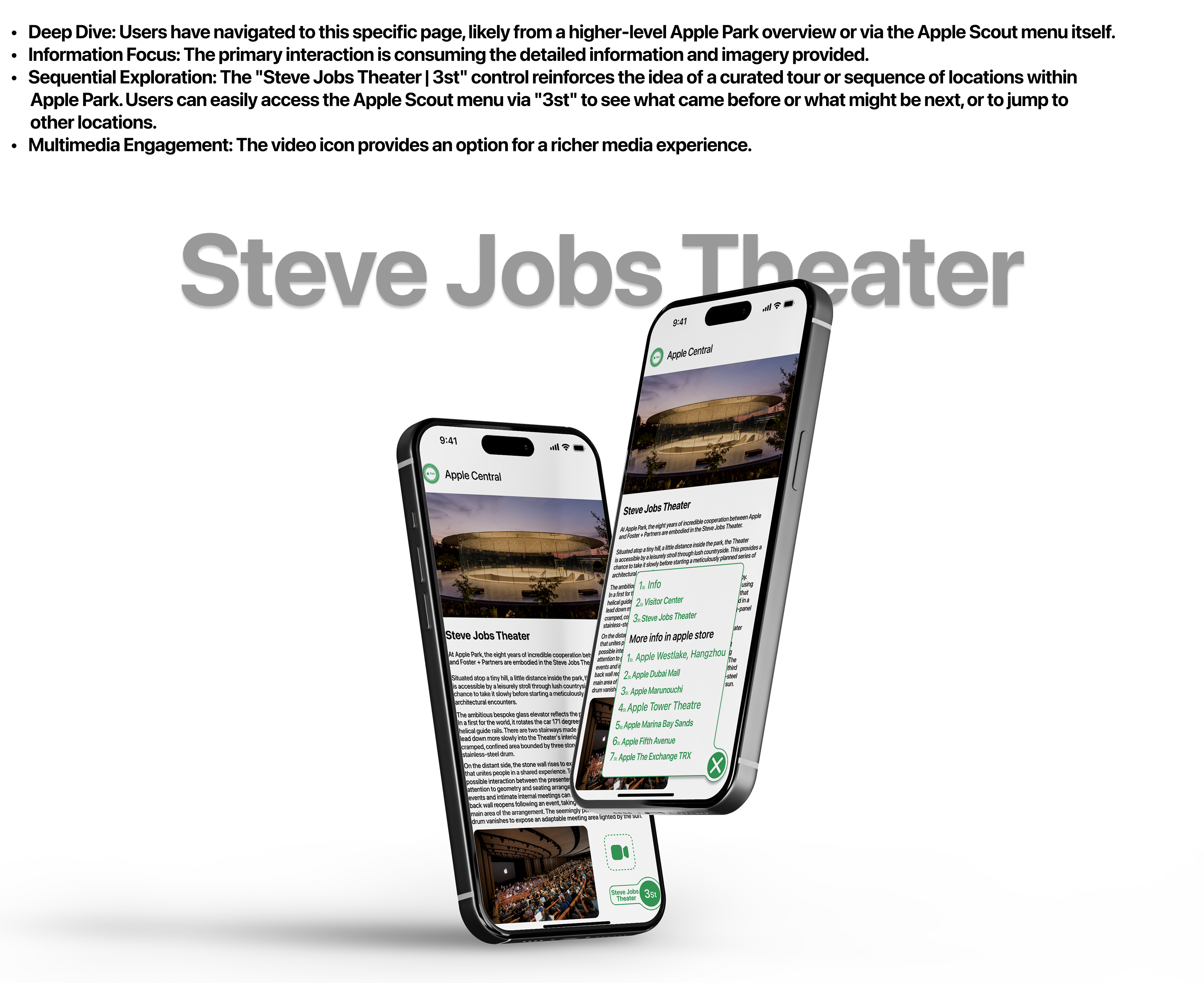
Image-Centric: Large, high-quality hero images dominate the top of each screen, providing an immersive visual introduction to the location.
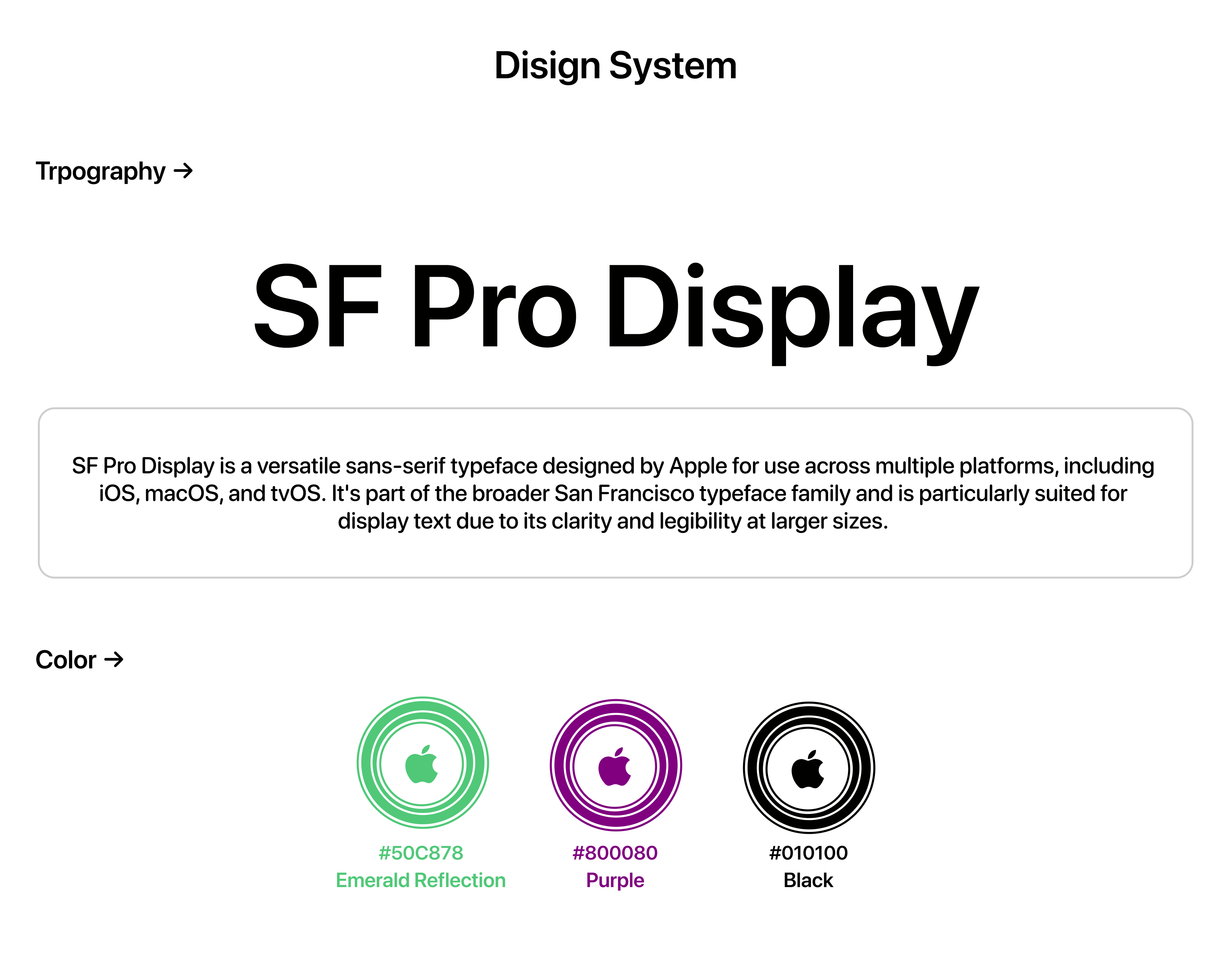
Typography: Employs clear, legible sans-serif fonts (likely Apple's San Francisco) with good hierarchy for titles, subtitles, and body text.
Consistent Layout: Each location screen generally follows a pattern: hero image, bold title, descriptive text, and sometimes smaller inline images.
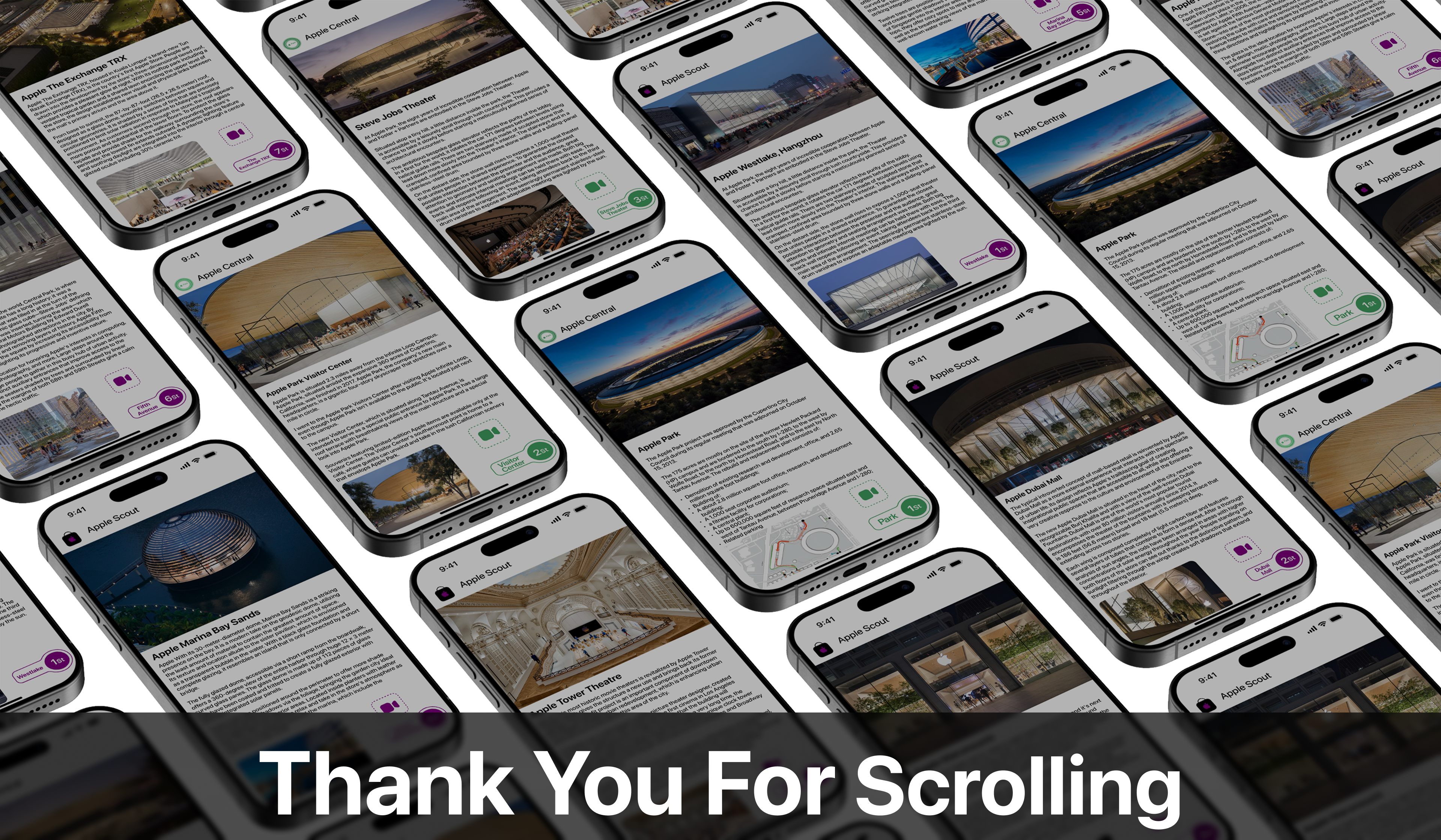
Color Coding: Distinct color schemes differentiate the two apps: green for "Apple Central" and purple for "Apple Scout."
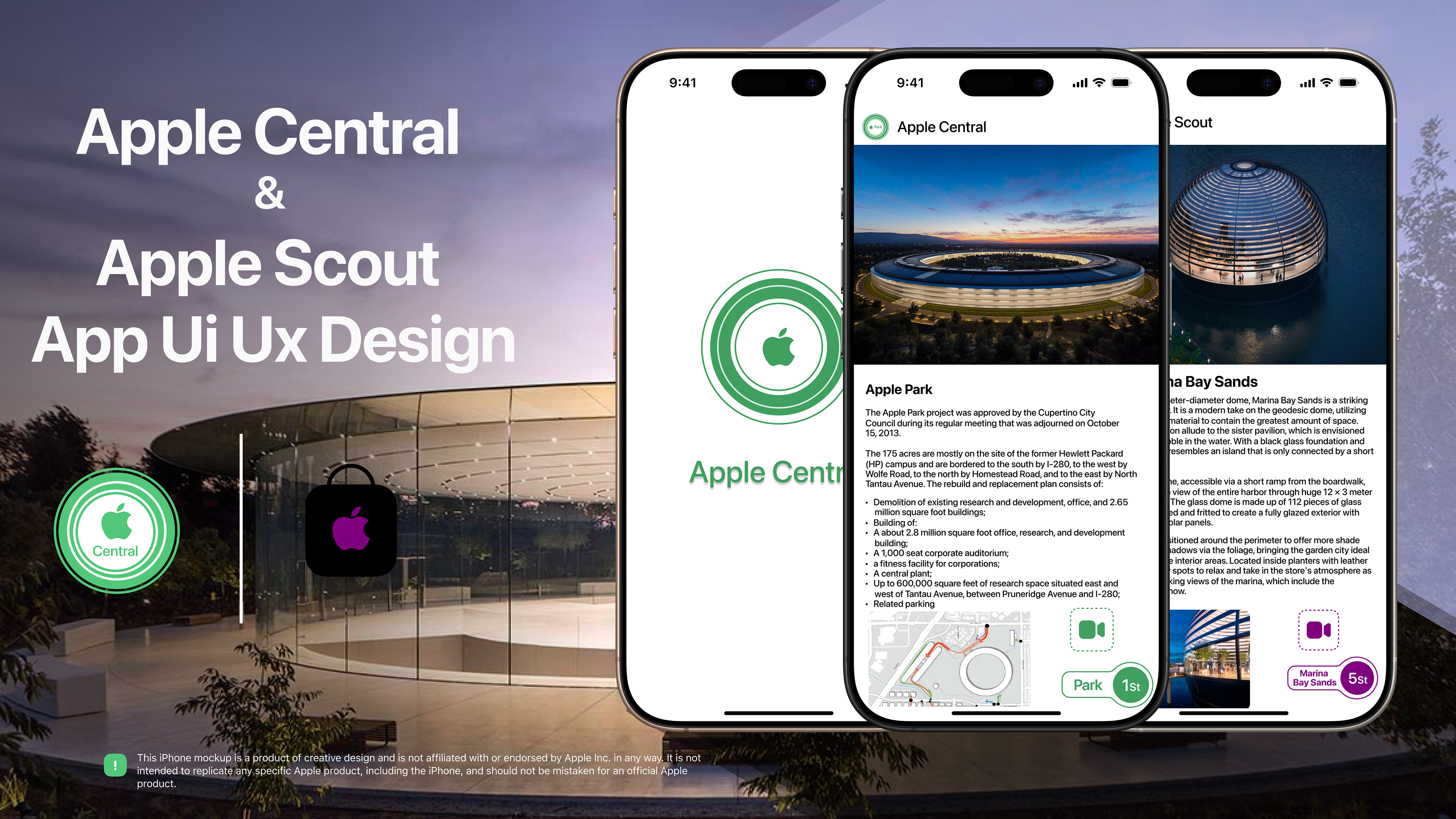

Apple Central (Green Theme):
Purpose: Appears to be an informational app focused on Apple's corporate locations, particularly Apple Park and its various components (Visitor Center, Steve Jobs Theater).
Branding: Uses a green Apple logo variant with a "Park" or leaf-like element in the top navigation bar. The accent color for UI elements (like the bottom navigation) is green.
Content: Provides detailed information about the architecture, history, and features of these locations. Includes bullet points for key facts (e.g., Apple Park project details).
Navigation:
Top bar: App icon and "Apple Central" title.
Main content: Scrollable.
Distinctive Bottom Navigation: A persistent element in the bottom right corner features:
A green FaceTime-like icon (perhaps for virtual tours or video information).
Two connected pill-shaped buttons: one displaying the current section's name (e.g., "Park," "Visitor Center") and the other indicating its sequence (e.g., "1st," "2nd," "3rd"). This suggests a way to navigate through different facets or pages of information about a single main location.

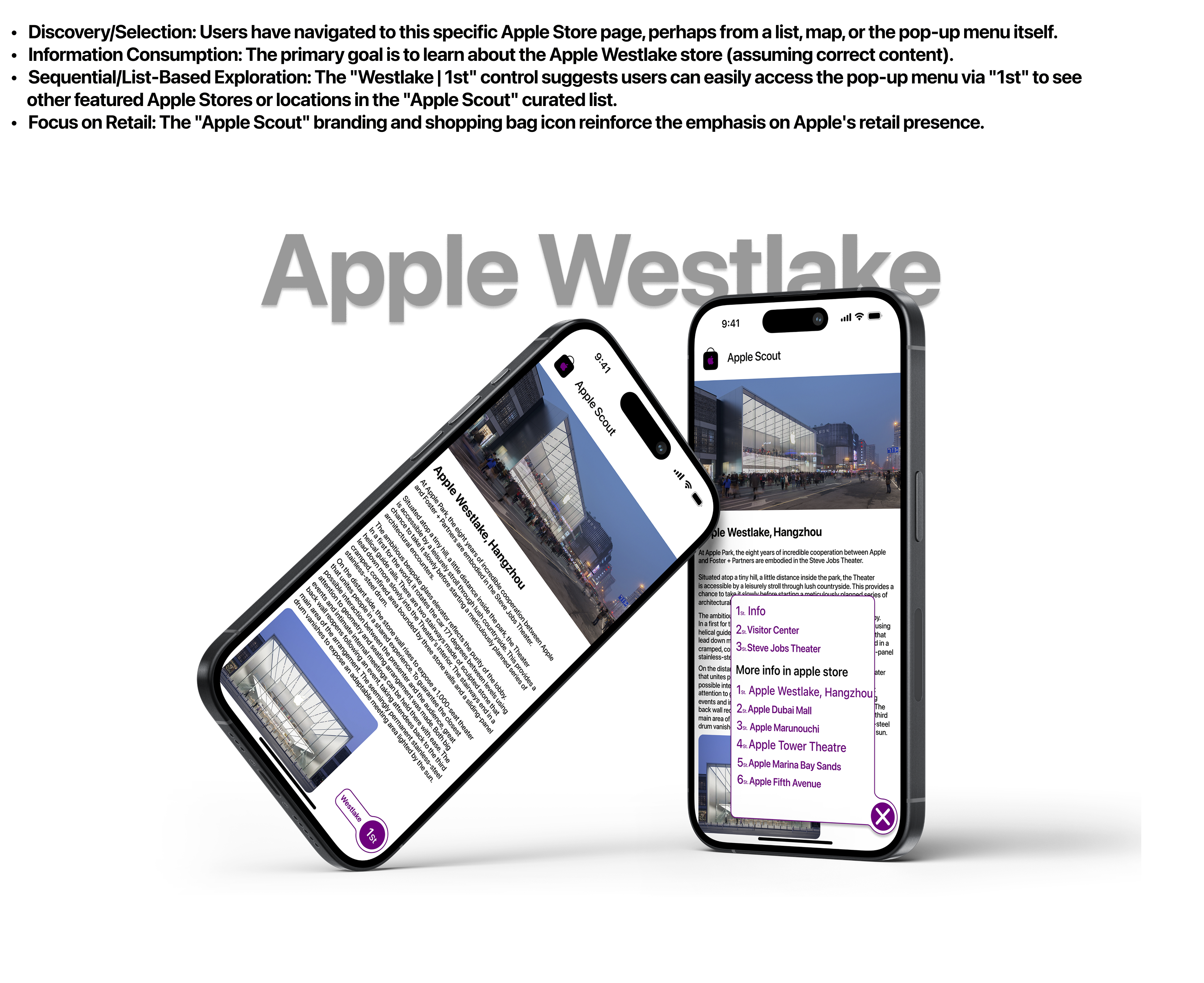
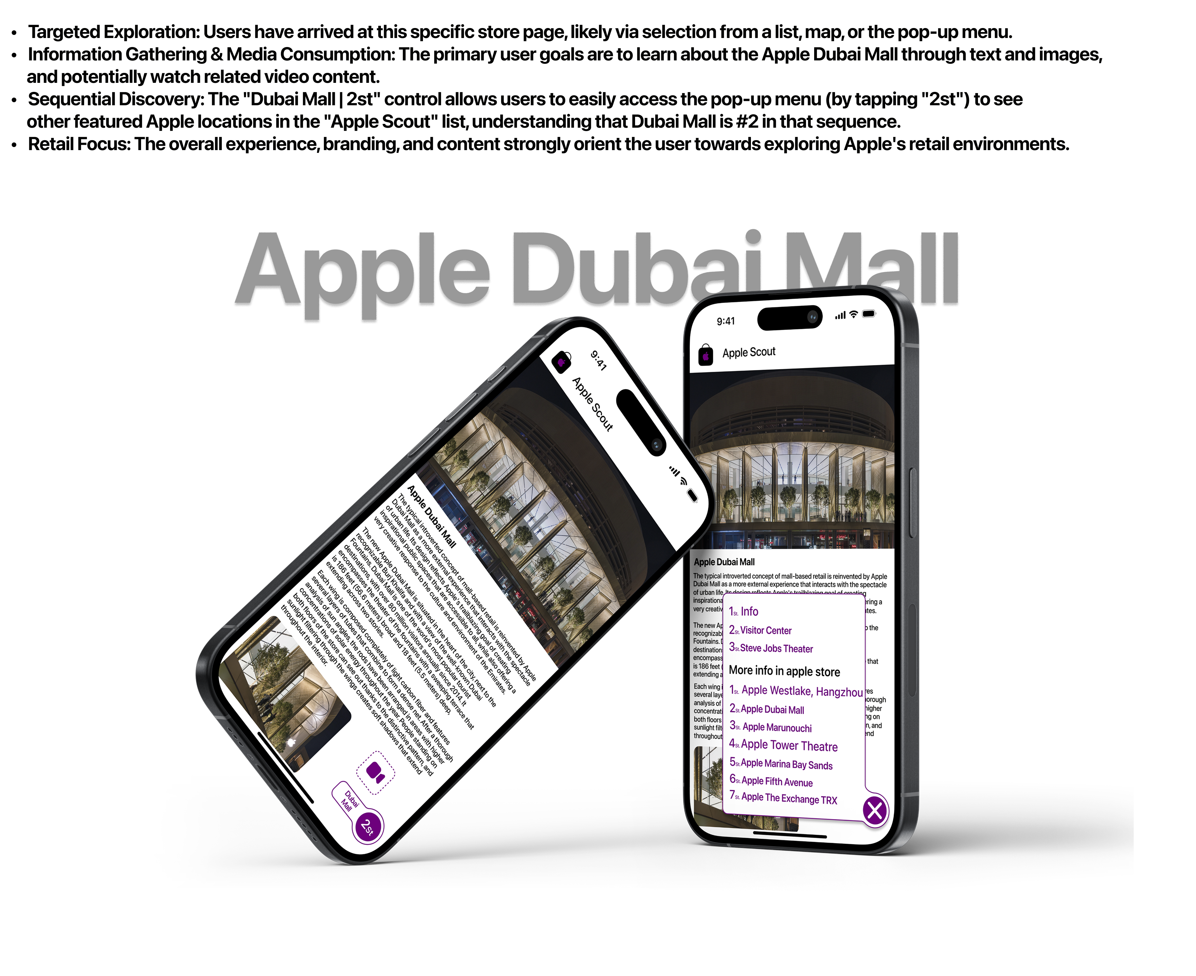
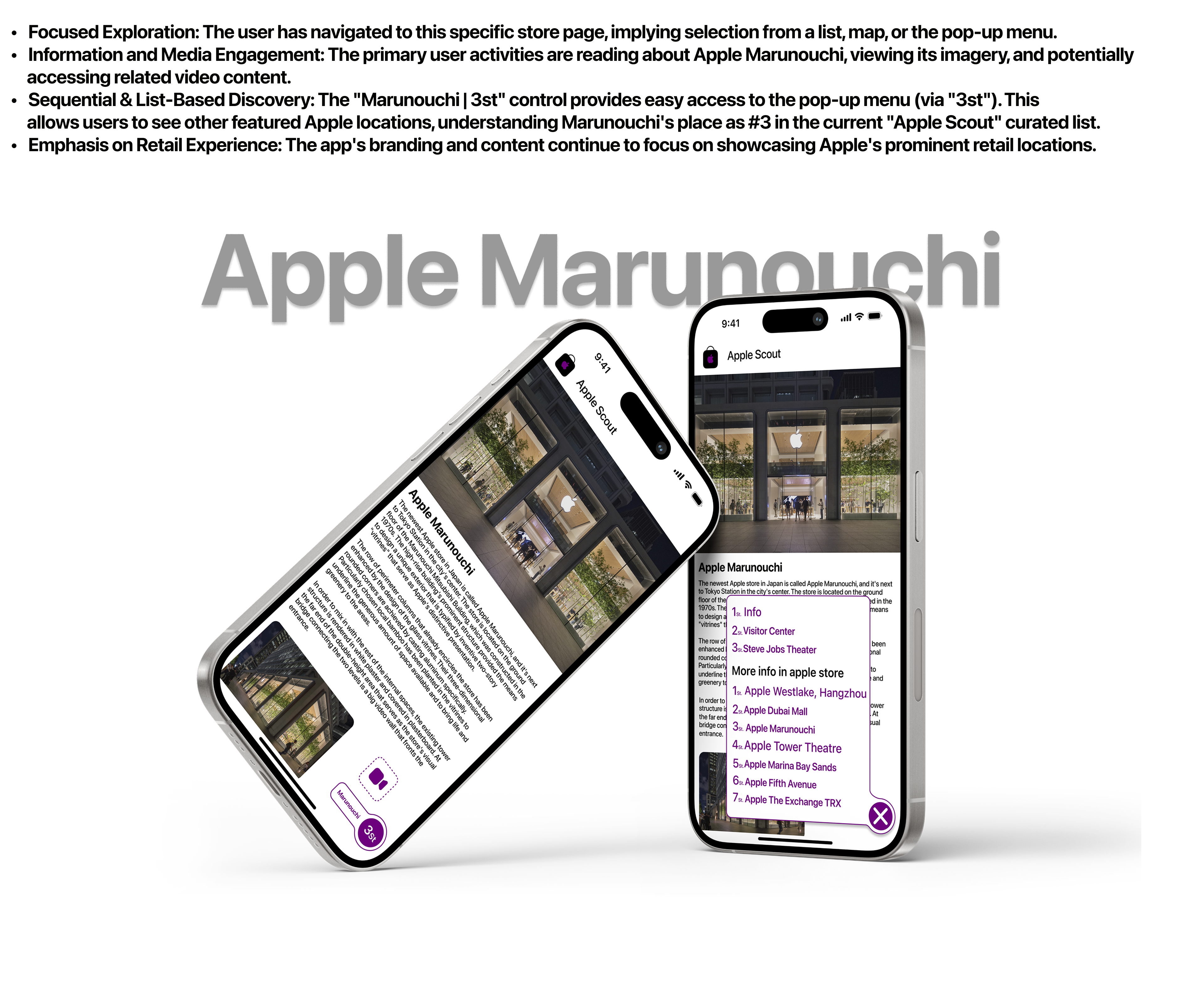
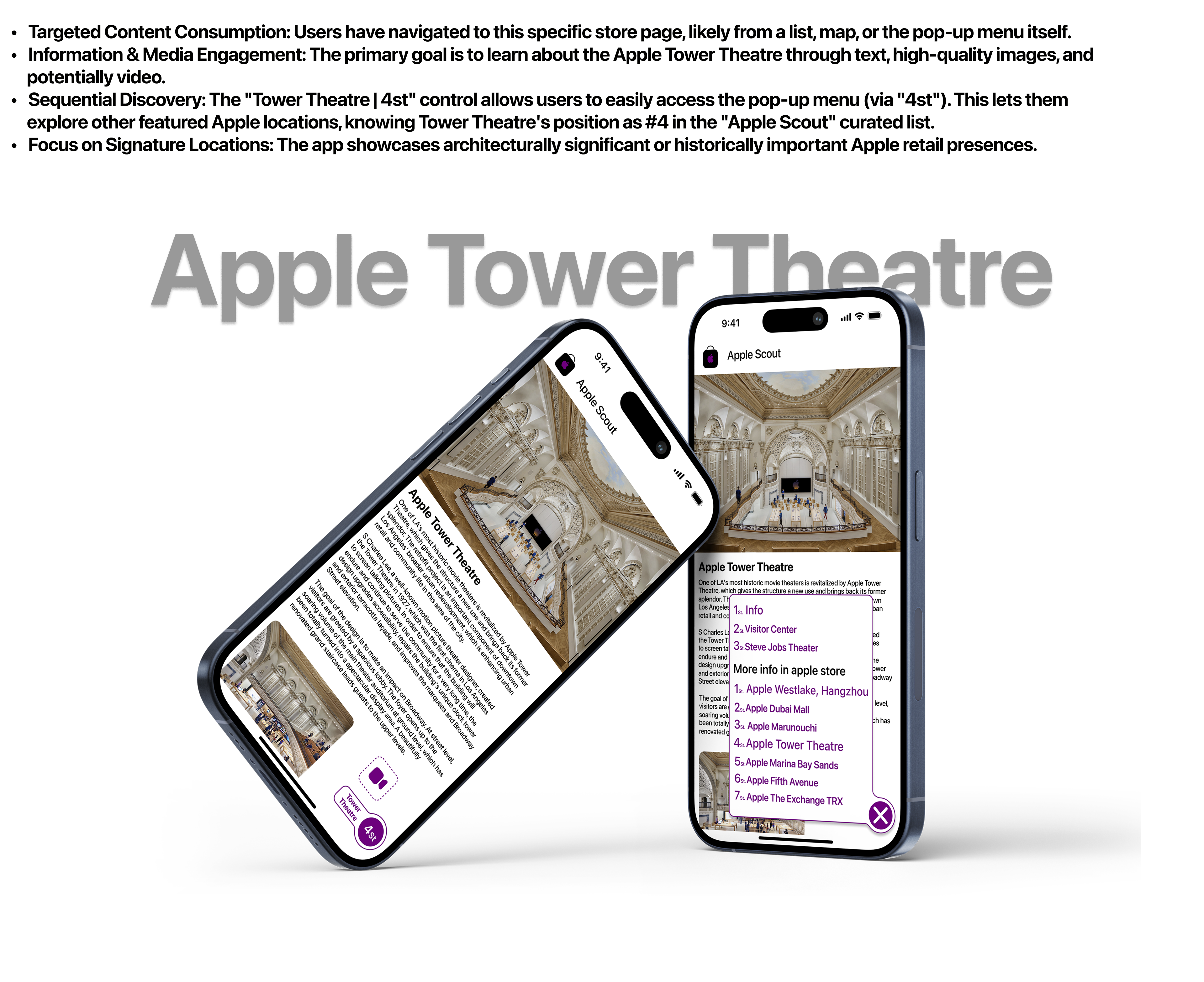
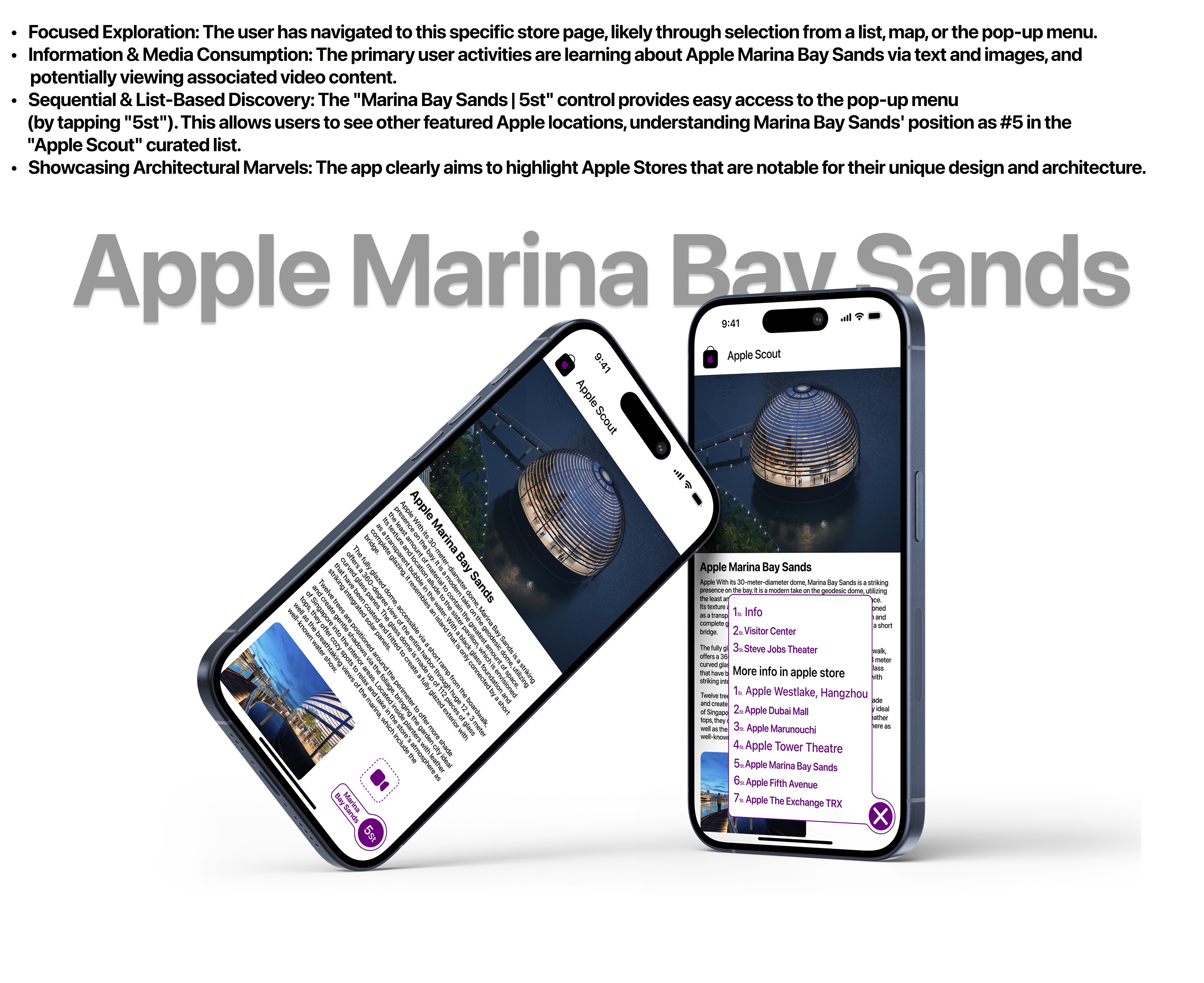
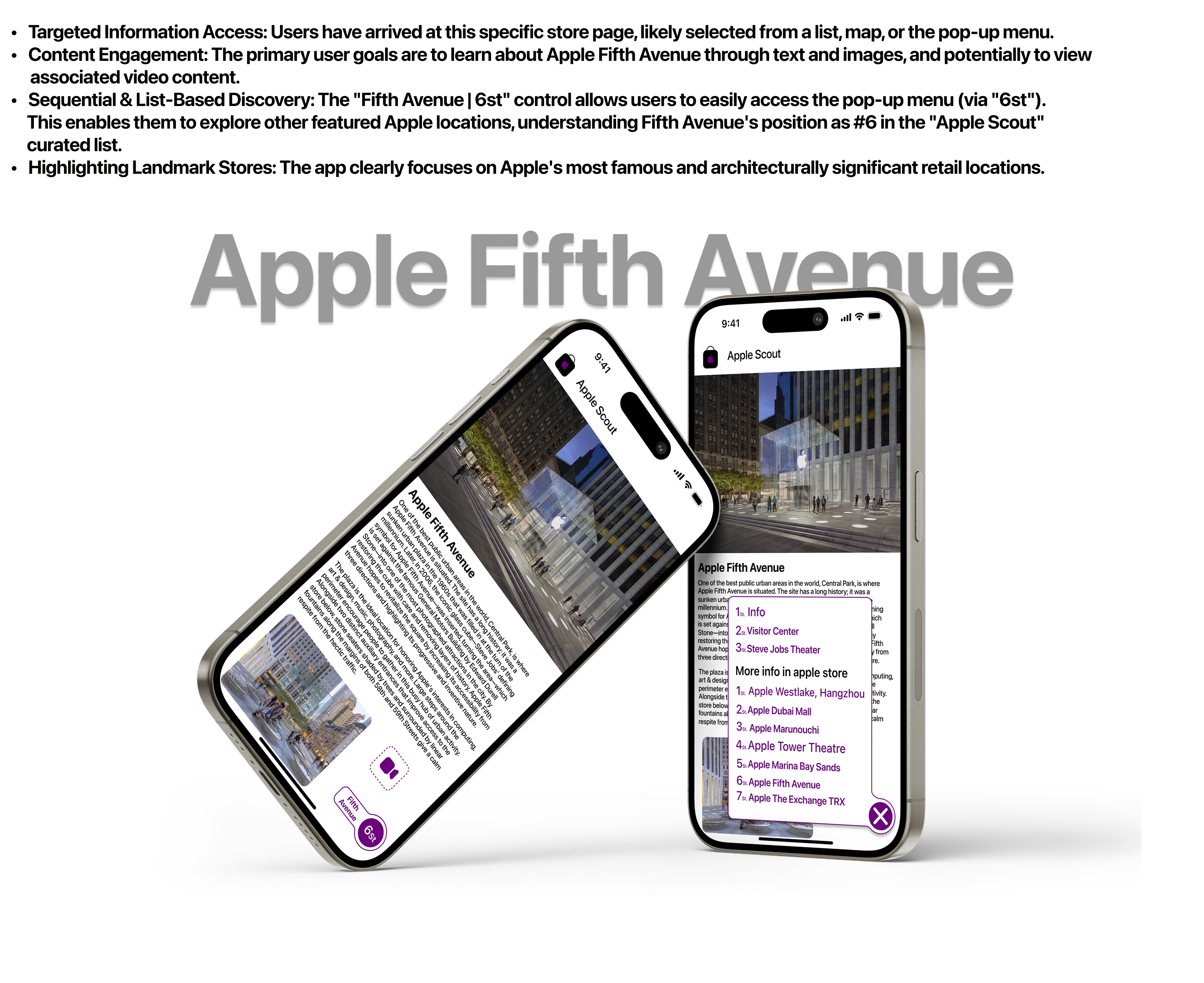
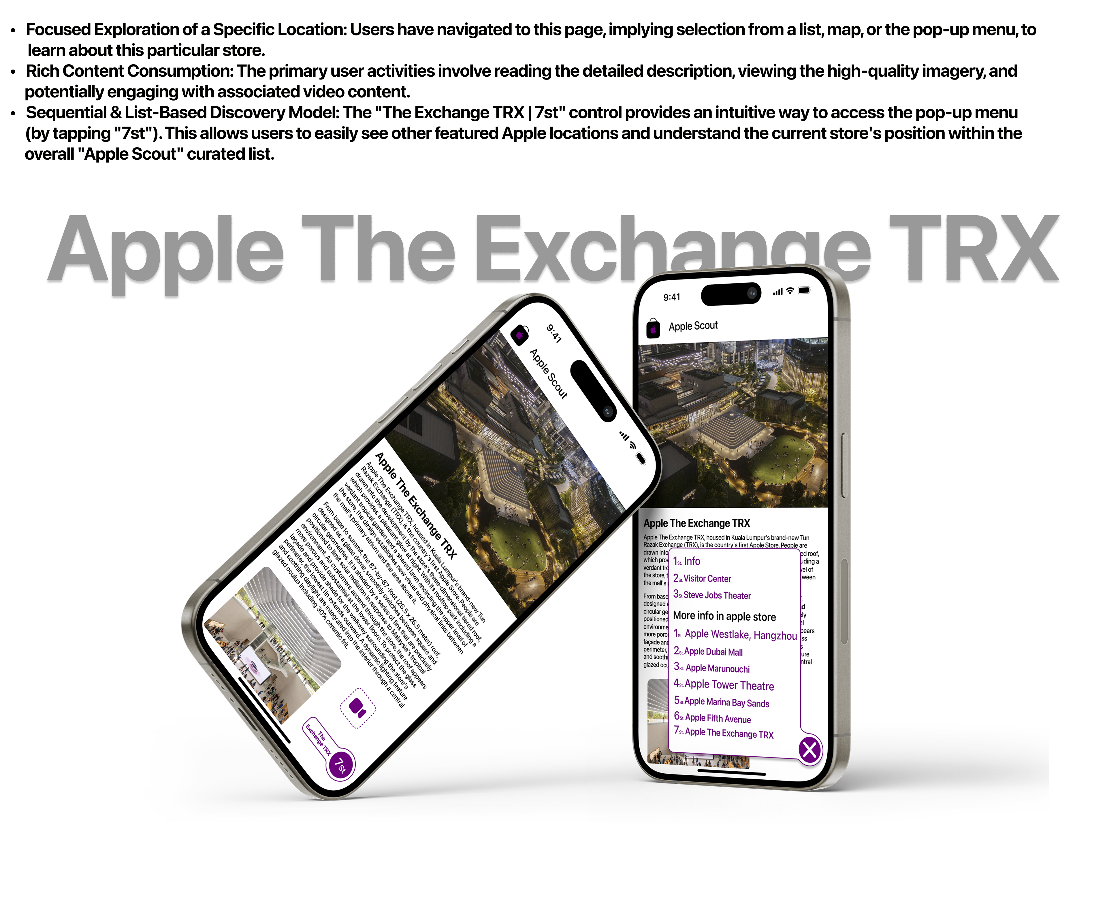
Apple Scout (Purple Theme):
Purpose: Appears to be a guide or showcase for Apple's flagship retail stores around the world (e.g., Westlake, Dubai Mall, Marunouchi, Marina Bay Sands).
Branding: Uses a purple Apple shopping bag logo in the top navigation bar. The accent color for UI elements is purple.
Content: Highlights the unique architectural design, features, and experience of each store.
Navigation:
Top bar: App icon and "Apple Scout" title.
Main content: Scrollable.
Distinctive Bottom Navigation: Similar to "Apple Central," but themed purple:
A purple video camera icon (perhaps for store walkthroughs or promotional videos).
Two connected pill-shaped buttons: one with the store's name (e.g., "Westlake," "Dubai Mall") and the other its sequence number (e.g., "1st," "2nd," "3th," "4th," "5th," "6th," and "7th,"). The "5th" for Marina Bay Sands implies some locations might have more extensive information.